Search This Blog

Saturday, June 5, 2010

Layout: illustration and text


An example of a layout. Drawing simple thumbnails like this gives me a rough idea on how the layout should look; where would the picture best be suited on a page and how the text should accompany it. There are many kinds of layout depending on the size of the illustration and text. For a book or magazine, a double page spread is commonly used.

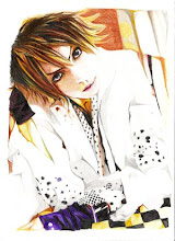
After much brainstorming and coming up with ways to present it, (including scanning it and working on Photoshop to create a page cover) I decided to maintain the traditional form of it using basic materials like inks and watercolour.
I worked on a large scale for the final outcome, the drawing was done on an A3 water colour paper. As for the accompanying text, I experimented with different calligraphy techniques with quills and dip-pen onto different surfaces like drawing cartridge, tracing paper and calligraphy paper.

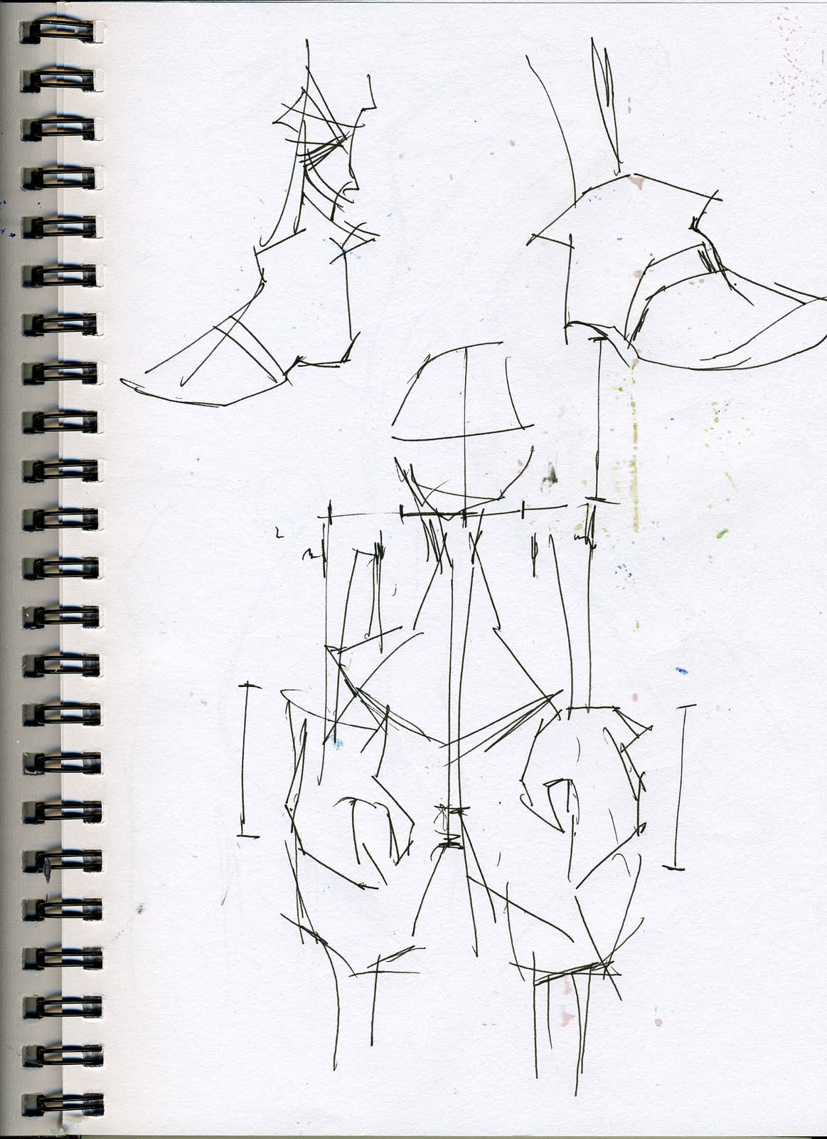
My experiments can be found in my sketchbook. 

Thursday, May 13, 2010

Poetry Research: The Spider and the Fly

Illustration by Tony DiTerlizzi, which is an adaptation of Mary Howitt's classic poem "The Spider and the Fly"

The Spider and the Fly is a poem written by Mary Howitt in 1829. It remains one of the most memorable piece of literature to this date, and was recently re-made by Tony DiTerlizzi in 2003. The poem goes:

Will you walk into my parlour?" said the Spider to the Fly, 'Tis the prettiest little parlour that ever you did spy;
The way into my parlour is up a winding stair,
And I've a many curious things to shew when you are there."
Oh no, no," said the little Fly, "to ask me is in vain,
For who goes up your winding stair can ne'er come down again." "I'm sure you must be weary, dear, with soaring up so high;

Will you rest upon my little bed?" said the Spider to the Fly.
"There are pretty curtains drawn around; the sheets are fine and thin,
And if you like to rest awhile, I'll snugly tuck you in!"
Oh no, no," said the little Fly, "for I've often heard it said,
They never, never wake again, who sleep upon your bed!"

Said the cunning Spider to the Fly, " Dear friend what can I do,

To prove the warm affection I've always felt for you?
I have within my pantry, good store of all that's nice;
I'm sure you're very welcome -- will you please to take a slice?"
"Oh no, no," said the little Fly, "kind Sir, that cannot be,
I've heard what's in your pantry, and I do not wish to see!"


"Sweet creature!" said the Spider, "you're witty and you're wise,
How handsome are your gauzy wings, how brilliant are your eyes!
I've a little looking-glass upon my parlour shelf,
If you'll step in one moment, dear, you shall behold yourself."
"I thank you, gentle sir," she said, "for what you're pleased to say,
And bidding you good morning now, I'll call another day."


 The Spider turned him round about, and went into his den,
For well he knew the silly Fly would soon come back again:
So he wove a subtle web, in a little corner sly,
And set his table ready, to dine upon the Fly.
Then he came out to his door again, and merrily did sing,
"Come hither, hither, pretty Fly, with the pearl and silver wing;
Your robes are green and purple -- there's a crest upon your head;
Your eyes are like the diamond bright, but mine are dull as lead!"


 Alas, alas! how very soon this silly little Fly,
Hearing his wily, flattering words, came slowly flitting by;
With buzzing wings she hung aloft, then near and nearer drew,
Thinking only of her brilliant eyes, and green and purple hue --
Thinking only of her crested head -- poor foolish thing! At last,
Up jumped the cunning Spider, and fiercely held her fast.
He dragged her up his winding stair, into his dismal den,
Within his little parlour -- but she ne'er came out again!

And now dear little children, who may this story read,
To idle, silly flattering words, I pray you ne'er give heed:
Unto an evil counsellor, close heart and ear and eye,
And take a lesson from this tale, of the Spider and the Fly.

~*~

DiTerlizzi's drawing of the Spider leading towards the dollhouse

As with many children's poems, The Spider and the Fly hides a valuable lesson. It is a warning to maidens, young and old (such as the Fly), to take heed and beware the dark motives of an untrustworthy being (as portrayed in the Spider) that lurk beneath crafty, flowery compliments.

The issues of life and death is carefully explained through the use of a spider catching a fly, however a much deeper and sinister meaning hides behind subtle visual clues, highlighting the importance for parents to discuss issues such as trust and safety with their children.


Wednesday, May 12, 2010

Pencil sketches: Study of limbs

We recognize things from memory, however when it comes to portraying the image from our head onto paper can be challenging if we cannot remember the exact position of where things should be. (I always find it very difficult to draw a whole figure from the top of my head without any reference)

Doing simple observational sketches from time to time allows me to familiarize and memorize the forms of things we see everyday that are usually taken for granted.

The following are examples of my drawings. (Click the thumbnails to full-view image)


Rough pencil sketches of my own hand
I noticed the level of the thumb is halfway across the palm; not alongside the other four fingers or  near the bottom edge of the wrist.


Ink sketches of legs, paying particular attention to feet (in shoes)


Practice ink sketches using my less-dominant hand (left hand)


Rough ink sketches of figures

The walking figure: I notice that the position/level of the ankles differ with each stride. The ankle of the "pushing" foot is much higher than the other due to the upwards tip-toe position of the overall foot. If the level is the same, the stride motion would appear less convincing.

However if both feet are on a standstill, the base is flat and therefore the levels should be the same.

More of my sketches can be found in my sketchbook.

Friday, May 7, 2010

Project brief

Project brief outline 1
Client
Book publisher: Simon and Schuster.
Subject matter
Illustrations of people in places and possibly animals/make-believe creatures.

Approach
Storyboard or a series of drawings.
Aims
To recollect the imagery from a book and portray them in my drawings. 
Primary sources
Observational drawings, photographs, ink doodles.
Secondary sources
Websites; of authors and blogs of chosen artists
Books; favourite childrens’s books garnished with drawings from chosen artists (books by Terry Pratchett illustrated by Jonny Duddle, and Holly Black illustrated by Tony DiTerlizzi etc)
Techniques and processes
  • Drawing inks
  • Gouache
  • Watercolour and colour pencils
  • Oil pastels
  • Experiments with various materials to see which ones work well, either on their own or with other materials, and using illustrations of chosen artists as a guide.
Outcomes
Probably a storyboard or comic book format, but what I have in mind at the moment is a series of illustrations to accompany short snippets from a story, presented in a large scale (probably A2 or A1). If it is possible, I would like to see if I could create a Flash comic by scanning my drawings onto Photoshop and work over it.
How will you review work (Planning, timescale, changes and modifications)
I will be recording my progress as I go along, and taking pictures of my experiments to analyze them. I will continue to develop my own style.
How will you present outcome
My storyboards could be presented on mount board or in a handmade book cover to bind the drawings together. The scale would be slightly larger than the drawings, which would act almost like a large folder with pockets. If I were to create a Flash comic, it could be presented in a DVD format.


Project brief outline 2
Client
Book publisher: Faber and Faber, The Whitsun Weddings by Philip Larkin
Subject matter
Illustrations of objects described in the poem
Approach
A series of drawings to accompany snippets of Larkin's poems
Aims
To recollect the imagery from a book and portray them in my drawings
Primary sources
Observational drawings, photographs, ink doodles, experiments
Secondary sources
Websites; of authors and blogs of chosen artists
Books; research a series of classic poetry/short stories (books by Oscar Wilde and Sylvia Plath) and also stemming from my initial research, I will look into DiTerlizzi's version of The Spider and the Fly which was based on Mary Howitt's 1829 poem.
Techniques and processes
Drawing inks
Watercolour and colour pencils
Oil pastels
Start to carry out ideas, techniques and a style that I have developed and working towards a final outcome.

Outcomes
A series of illustrations to accompany short snippets from poems, presented in a large scale (probably A2 or A1)
How will you review work (Planning, timescale, changes and modifications)
I will continue to improve my original style. I will be recording my progress as I go along, and taking pictures of my experiments to analyze them.
How will you present outcome
My drawings will be presented on mount board or in a handmade book cover to bind the drawings together. Alternatively, they could be presented in my portfolio.

Thursday, May 6, 2010

Artist research: Jonny Duddle

Jonny Duddle illustrated for Terry Pratchett's latest book; Nation, which happened to be my discovery of another modern day illustrator.


What intrigued me was his digital coloration. His finished pieces are usually coloured works, mainly for the main cover whereas his accompanying ink sketches remain in their black and white outlines. 


Duddle's drawings first consists of pencil sketches, and are then coloured over using Painter and Photoshop. His style is very broad; they can appear to be quite cartoon-like, whereas some can appear quite sinister.


An example of a more cartoonised version of his style. It gives a very happy and up-beat appearance...


... contrasting with an example of his more dark and sinister drawings. 


The link to Duddle's website can be found at the bottom of this blog.

Monday, May 3, 2010

Final piece progression

Photographs of my final pieces in their progression state.
Some of the background accents were not added at this point, so it gives a more simplistic appearance which makes it clear to determine how the final outcome should look like.


Thursday, April 29, 2010

Artist Research: Florian Nicolle

Florian Nicolle is a graphic designer and illustrator.
The thing that intrigues me is his choice of materials, which is ink worked over collage paper. They bear a few resemblance with Dave McKean in terms of materials, however Nicolle's brush strokes are more free and spontaneous, with the occasional fine line detail using a dip pen.
The collage background creates highlights in certain areas, usually made up of printed words on paper and lightly stained.

Saturday, April 17, 2010

Artist research: Robert Ingpen

I looked into a few classic Children's books and one of the few that first came to mind were those by author Charles Dickens. I managed to find A Christmas Carol, which was illustrated by Robert Ingpen.


I scanned a few examples of his drawings. His style is incredibly detailed and realistic, and very few aspects of the characters were "cartooned".

What intrigues me are his pencil sketches. The toning helps to accentuate the details in the features, and most of them tend to be worked over stained paper.  

Perhaps Ingpen obtained his subject matter through observational resources in order to achieve such high level of detail. Some of them appear to be unfinished, only picking out the important features with tone.

His works are very dark and sinister from what the non-coloured sketches portray. Again there is  constant use of washed background worked over with graphite, pencil and charcoal.


Ingpen uses rich, bold colours on certain areas, in this case mainly to suggest importance of the scene; warm colours were used to convey warmth and vice versa. The stained backgrounds play a part in this as well, acting as a contrasting hue to accentuate the main subjects. 

Wednesday, April 14, 2010

Group Meeting: General Career Paths

How do illustrators operate on a daily basis:


(www.skillfast-uk.org) I looked into this site which provides tips on job profiles, case studies as well as information on qualifications which is essential in order to pursue particular careers. 


General discussions:
  • Sending samples of work to magazines or newspapers.
  • Organize portfolio and update constantly.
  • Important to start in a wide range of work, be more flexible and broad-minded with the subject area, before being able to establish self as personal illustrator.
Specific and more in depth discussions.
Personal investigation
Examples from artists within the specialist area:


Brett Helquist:-
Started an internship with illustrator Robert Neubecker and "showing portfolio" whenever possible. Eventually jobs for newspapers and magazines were offered little by little, (within the period of seven years), at the same time working as a graphic designer. In spare time he developed a way to draw without using models.
Eventually decided to pursue a career in Children's books (first book was "The Bad Beginning" by Lemony Snicket).
Source: (www.bretthelquist.com)


Tony DiTerlizzi:-
After art school, DiTerlizzi began as a freelance illustrator working for TSR (game company for Dungeons and Dragons) and continued to illustrate for the gaming industry for seven years. He eventually decided to specialize in children's picture books. Wrote and illustrated his own books, as well as collaborating with authors to this day. 
Source: (www.diterlizzi.com) (http://en.wikipedia.org/wiki/Tony_DiTerlizzi)


Tuesday, April 13, 2010

Research Courses: Art & Design

The following links are of University and College Foundation courses for Art & Design:

Art and Design (Foundation Studies) BTEC Diploma: course from De Montfort University, UK


Art and Design (Foundation Studies): course from Loughborough University
http://www.lboro.ac.uk/prospectus/ug/courses/dept/foundation/adf/index.htm


Art and Design (Foundation Studies): course from Leicester College
http://www.leicestercollege.ac.uk/index.php/About-Art-and-Design-Courses.html
The PDF course guide can be viewed here:
http://www.leicestercollege.ac.uk/docs/guides/FullTime1011/LC_Full_Time_Course_Guide_1011_Art_and_Design.pdf

Saturday, April 10, 2010

Artist research: N.C Wyeth

Brett Helquist once wrote that his main influences were N.C Wyeth, who was a pupil under Howard Pyle. Wyeth was an American artist and illustrator. He drew more than three thousand paintings during his lifetime, and illustrated for many books. I decided to look into samples of his works.


There is a firm resemblance between Wyeth and Helquist's styles. Both are mostly action-based (there is often a clear sense of movement within the subjects in action) and also the use of rich, bold colours.


Comparison:
Their techniques in conveying motion is intriguing. The compositions of the subjects and the direction they face play an important role to make the sense of movement look convincing. Wyeth and Helquist are particularly skilled at capturing moving subjects in a still.

A drawing by N.C Wyeth, portrays a man riding a horse

Illustrated by Brett Helquist, an extract from a children's book titled "Hook"

Monday, March 29, 2010

Plan for Easter (2 weeks)

1st Week 29th March

  • Move away from artists' influence and start developing own style
  • Start thinking about storyboard layout and story
  • Rough draft of drawings first before working on the final outcome, which will be a series of illustrations put together with a bit of text (?)


2nd Week 5th April

  • Start to think about scale (decide whether it would simply be traditional or whether it is possible to scan it onto the computer and work from there)
  • Decide on what materials to use. (Mostly inks and watercolours, but what else?) 
  • Start to carry out ideas, techniques and original style that have been developed and working towards a final outcome.


.

Saturday, March 20, 2010

Gouache


To achieve a layered effect, I experimented with gouache paint, which can be used in a very diluted form (like watercolour) or in a thicker format (such as poster colour). 
I can also build up the colours by applying layers on top of each other. For the lighter areas, I diluted the colours a lot so as not to let it dominate too much. The darker areas are much thicker, allowing me to put more than one layer on certain areas.
I have to keep in mind to not overdo the layering, as the paint would eventually crack when it becomes too thick.

Oil Pastel Sketches


The following are more observational drawings done in oil pastels. Again, I have been experimenting with various colours to achieve different effects.
This one consists of warm colours.


I also tried combining cold colours together. I took the technique a step further by bringing in other materials like ink washes, and colour pencils for fine details, paying extra attention to highlights and tone.

Friday, March 19, 2010

Health and Safety: Drawing Inks

HAZARDS IDENTIFICATION
Present no hazard to health under normal conditions of use

FIRST AID MEASURES

Eye Contact Irrigate with water for several minutes. Seek medical attention if symptoms persist.
Inhalation Unlikely to be a route of entry.
Skin Contact Wash with soap and water immediately as dried film is water resistant.
Ingestion If swallowed do not induce vomiting. Give water to drink and seek medical attention.

ACCIDENTAL RELEASE MEASURES

Small spillages should be wiped with a damp cloth or flushed away with water. Large spillages should be absorbed onto sand or earth and collected in a suitable container for disposal.

HANDLING AND STORAGE

Colours can stain. Take the necessary precautions to protect clothing and furnishings. Product should not be allowed to freeze.

DISPOSAL
Small quantities may be disposed of as domestic waste. Large quantities in accordance with local authority regulations.

Health and Safety: Watercolour

Hazards
  • Low hazard expected under normal conditions of use
First Aid Measures
  • After contact with skin wash immediately with plenty of water
  • Contact with eyes, immediately wash out with plenty of water for several minutes and seek medical advice if irritation persists
  • Ingestion; give plenty of water to drink and seek medical attention if ill effects occur
  • Inhalation; is unlikely to occur. Remove patient to fresh air
  • When in doubt or symptoms persists, seek medical attention
Exposure controls/personal protection
  • Use good personal hygiene practices
  • No special vantillation is required unless the product is used in a spray form.

Sunday, March 14, 2010

Responses to Dave McKean's work

I tried to create a similar effect of Dave McKean's drawings using materials that were available to me. These drawings were done with oil pastels on coloured sugar paper to achieve a sandy texture.
I started by copying the image from Dave McKean to familiarize myself with the style and technique.

The background was particularly challenging to achieve, but I tried using dynamic linear forces with oil pastels to resemble the original as best as I could, using similar colours.
I then developed the concept further by doing observational drawings of classmates using the same materials and style, also experimenting with more vibrant/warmer colours to achieve a different effect.
I chose a suitable colour of paper for the background to accentuate the subjects. For instance the blue tone works harmoniously with the green background, both of which are cold colours. Above: The purple background compliments the red tones, in a sense that the red is a warm colour whereas the purple is more like a subtle blue shade.


Dave McKean

I noticed a resemblance of Dave McKean's style in my ink drawings. I took examples of his comic/ storyboard, which were made using a variety of materials (the drawings were usually done in ink, chalk or charcoal) and collage technique.
His style have a rather dark and gloomy aura, mainly due to his choice of dark colours (usually cool colours like dark blue and violet) and rough cross-hatchings with charcoal to add depth.


The subjects seem to be worked over a black background, adding a greater sense of menace to the atmosphere. Some parts of his drawing are quite simple with only the outlines of the subject and stained with a touch of colour.


McKean's collage technique is more apparent on some pages. He arranged layers of photographs and text on top of each other to accent his drawings. The choice of colours still remain the same.

Ink sketches from imagination


A few examples of ink drawings from my imagination. I tried to portray a sense of fantasy in them by coming up with commonly peculiar structures that tend to exist in the genre.